
Accessible web design is the practice of designing websites that are usable by as many people as possible, including those with disabilities. It is important to design with inclusivity in mind—not only is it good design, it’s also a legal requirement under laws like ADA Title II and VA HB 2541.
This guide will walk you through practical steps for creating an accessible website, including specific instructions for how to perform certain tasks in WordPress.
Page Structure and Text Content #
Headings #
Headings organize your content and make your website more readable to visitors to your site, screen readers, and search engines.
Visually, headings help organize content by appearing larger or more distinct than the surrounding text. This structure guides the eye around the page, making it easier for all users, including those with cognitive disabilities, to find and understand information.
Headings are also critical for screen reader users. Screen readers can list all headings on a page, allowing users to jump directly to the section they need.
Important: Simply bolding or enlarging text does not make it a heading. Headings must be properly formatted using heading tags (e.g., Heading 2, Heading 3) so assistive technologies can recognize and use them.
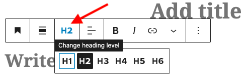
Headings in WordPress #
In WordPress, there is a Heading block. The title of your page or post is automatically assigned as Heading Level 1 (H1). You should only have one H1 per page, this serves as the main title.
Think of headings like an outline that helps both readers and screen readers understand how your content is organized:
- Use Heading Level 2 (H2) for the main sections of your content.
- Use Heading Level 3 (H3) for subsections within an H2.
- Use Heading Level 4 (H4) for divisions within an H3 and so on, only if needed.
This creates a clear hierarchy, rather than a simple list. For example:
H1: Planning a Trip
H2: Choosing a Destination
H3: Factors to Consider
H3: Research Tools
H2: Booking Travel
H3: Flights
H3: Accommodations
If you don’t like the default appearance of a heading (size, color, etc.), you can customize it using the block settings in the right-hand sidebar.
Lists #
Bulleted and numbered lists help organize content and make it easier to scan and understand. For screen reader users, lists are especially helpful because the screen reader announces that a list is present and how many items it contains.
To make lists more meaningful, always include a brief introductory sentence that explains what the list contains. For example, in the sentence “When using lists, be sure to:”, the colon signals that the following content is a list of recommended actions.
Lists in WordPress #
In WordPress, the List block is used for both unordered and ordered lists. Some themes allow you to modify the look and feel of the list block. Be sure to use this block instead of typing dashes or adding numbers manually.
Text Style & Contrast #
Font size, style, and color all affect how easily users, especially those with visual impairments, can read your content. A good minimum font size is 16 pixels (or 12 points). When selecting fonts, choose styles that are easy to read, such as sans-serif fonts (like Arial or Helvetica).
Also, make sure there is enough contrast between your text color and background color. For example, black text on a white background may seem plain, but it’s one of the most accessible and readable combinations you can use.
Text Style & Contrast in WordPress #
In WordPress, your site’s theme controls the default font styles, sizes, and colors—this means headings, paragraph text, and link colors are often pre-set based on the design choices of the theme. Some themes prioritize readability and accessibility, while others may require more customization to meet accessibility standards.
When you’re creating or editing a page or post, you can change the appearance of your text directly from the right-hand sidebar of the Block Editor. Selecting a text block (like a Paragraph or Heading) reveals options such as:
- Font size (e.g., Small, Normal, Large, or Custom)
- Text color
- Background color
- Font appearance (like bold, italic, or font family depending on theme support)
While you can override the theme defaults here, it’s important to maintain good contrast between text and background for accessibility. WordPress will alert you if your color combination may be hard to read.
If you’re unsure whether your chosen style is accessible, consider using a contrast checker to verify readability.
Links #
Descriptive Link Text #
Hyperlinks are incredibly helpful as they allow for users to simply click and be taken to the linked page. However, it is important to include a description of the link’s target within the text of the hyperlink itself. Here are some examples:
Good: Descriptive Link Text #
Learn more in our Accessible Visual Design Guide.
This link text clearly communicates where the link will take the reader. They can make an informed decision about whether they need to click the link
Bad: Poor Link Text #
If you want to learn more, click here!
This text does not give enough information for the reader to know where the link will take them.
Worst: Naked Link #
Here’s a link to find out more! https://www.google.com/search?q=dkc+visual+design
This link does not give clear information, and is an utter disaster for anyone using a screen reader.
Link Actions #
Also avoid forcing links to open in a new tab or window, as this can be disorienting for users using assistive technology. If you must do so, clearly signal this in the link text. For example: DKC Accessible Web Design Tool Guide (opens in a new tab)
Visually Distinctive #
Link text should look visually different from the surrounding text. Use a combination of color and style, like underline, to make link text stand out. Using a combination is important. It’s not enough to convey information using color alone. A common combination is underlined text with a blue font color, as seen above.
Links in WordPress #
In the WordPress editor, adding a link is simple:
- Highlight the text you want to link.
- Click the link icon in the block toolbar.
- Paste in the URL and press Enter.
Styling of links is controlled primarily by your site’s theme. Most accessible themes will automatically make links visually distinct from normal text using color and underlines.
If you notice your links are not clearly visible or rely on color alone (e.g., blue text with no underline), consider:
- Choosing a theme that meets accessibility guidelines
- Adding underlines manually when needed for clarity
- Advanced users may be comfortable adding custom CSS to adjust text style to underline all links on the site.
Visual Design #
Images #
When you incorporate an image like a photo, chart, or infographic on your site you’ll want to consider:
- Text descriptions of images (alternative text)
- High contrast
- Colorblind friendly color choices
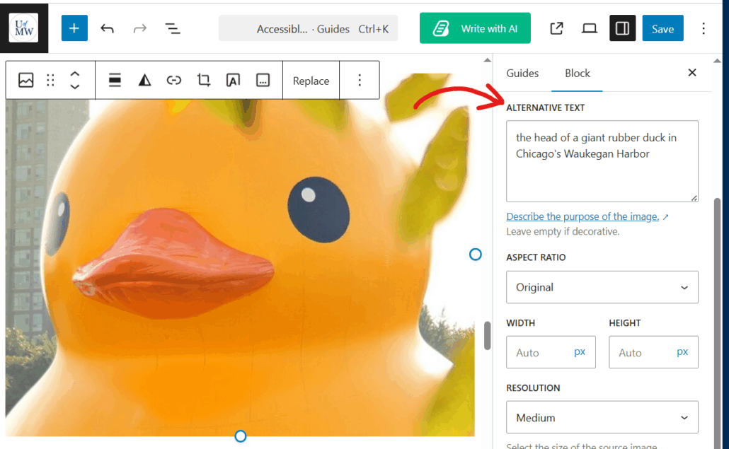
Alternative Text for Images #
Any image on your site that conveys information should have a text alternative, usually provided as alt text. Alt text answers the question: What information does this image communicate? Imagine describing the image to someone who cannot see it, what essential details should they know?
Focus on describing the content and meaning of the image, not just its appearance. Screen readers will read this description aloud to users with visual impairments. Alt text also displays if an image fails to load and helps search engines understand your content better.
Alt text isn’t just for web images, it should be added to all visual media, including Word documents, PowerPoint slides, email newsletters, and PDFs. While some programs may automatically generate alt text using AI, it’s best to review and improve these descriptions to ensure accuracy and clarity.
Infographics, Charts, and Other Complex Visuals #
Images like infographics, graphs, and charts often convey detailed or data-heavy information. In these cases, simple alt text may not be sufficient. Instead:
- Summarize the key message or insight of the graphic in the alt text (e.g., “Bar graph showing a steady increase in enrollment from 2020 to 2024”).
- Provide a longer description elsewhere on the page—either directly below the image or as a linked text alternative (e.g., “See full text description below the chart”).
- For infographics, consider offering a plain-text version of the entire content in a collapsible section, list, or table.
Alt Text in WordPress #
To add alt text to an image in WordPress, you have two options:
- When Adding an Image to a Post or Page:
- While editing a post or page, when you insert an image using the Image block, you can enter alt text directly in the block’s settings sidebar on the right. Look for the Alt Text (Alternative Text) field and provide a clear description before publishing.
- In the Media Library:
- Go to your Media Library in the dashboard, click on the image you want to edit, and enter your description in the Alt Text field under the attachment details.
For more information, see the DKC’s accessible visual design guide for more details on creating accessible images.
Video #
When adding video to your site, consider the following to ensure it is accessible to all users:
- Closed Captions: Provide accurate captions for all spoken content and important sounds. Captions support deaf and hard-of-hearing viewers and also benefit users watching without sound.
- Clear Audio: Ensure the audio is easy to hear and free from background noise or distortion so that users relying on hearing can understand the content.
- Audio Descriptions: For videos that rely on visuals to convey meaning (such as charts, actions, or on-screen text), include audio descriptions or ensure that key visual elements are described verbally within the video itself.
For more information, see the DKC’s Accessible Video Guide for tools and best practices to help you create inclusive video content.
Audio #
When adding audio to your site, consider the following to ensure it is accessible to all users:
- Provide a Transcript: Include a written version of all spoken content and important sounds. This helps users who are deaf or hard of hearing and also supports those who prefer to read or search content quickly.
- Ensure Clear Audio Quality: Make sure your audio is easy to hear, free from background noise, and recorded at a consistent volume.
For more information, see the DKC’s Accessible Audio Guide on how to create inclusive audio content.
Documents #
If you are uploading or linking to documents (such as Word files, PDFs, or presentations) on your site, it’s important to ensure they are accessible to all users.
If you’re uploading or linking to documents (like Word files, PDFs, or presentations), make sure they’re accessible.
For more information, see the Office of Disability Resource’s Access for All handbook for tools and best practices to help you create accessible documents.
Evaluate Your Site #
Use free tools to check for accessibility issues:
WordPress Plugins #
- Equalize Digital Accessibility Checker: Designed to help you more easily identify accessibility issues on your site.
- Editoria11y Accessibility Checker: It focuses exclusively on content issues, assisting authors at improving the things that are their responsibility. Will not flag issues with themes.
External Tools #
- WAVE Evaluation Tool – identifies issues with headings, alt text, contrast, etc.
- Colorblind Web Page Filter – helps simulate how your site looks to users with different color vision types
Test your site using both mouse and keyboard to make sure all functions are accessible without a mouse.
Learn More About Web Accessibility #
- WordPress Accessibility Handbook – WordPress guide to making sites accessible.
- Access for All – Website Accessibility – Created by UMW’s Office of Disability Resources, contains tips for designing websites that are accessible for all.
WordPress Specific Considerations #
Themes #
Choosing the right WordPress theme is a key first step toward building an accessible website. Look for themes that offer strong contrast between text and background and use clear, easy-to-read fonts.
WordPress offers an “Accessibility Ready” filter when browsing themes. While this label doesn’t guarantee full compliance with WCAG guidelines, it indicates themes are a healthy starting point and include:
- Ensuring the menus are accessible from the keyboard.
- Checking that default color contrast meets standards.
- That the HTML structure uses semantically correct code.
Themes without this label aren’t necessarily inaccessible, but they may require more careful review and customization.
Plugins #
Plugins can impact accessibility, especially if they generate content (like sliders or galleries).
There are no universal accessibility rules for plugins, so be cautious. If a plugin changes the public-facing site, test its output.
There are a number of accessibility plugins that can help monitor your site’s accessibility and aid users in navigating your site.
Reviewed by Abby Firestone 06/03/26
