
Accessible web design is the practice of designing websites that are usable by as many people as possible, including those with disabilities. It is important to design with inclusivity in mind, as it is not only good design but also increasingly legally important.
Page Structure and Text Content #
Headings #
Headings help to introduce new sections and organize the content on the page. They make your website more readable by humans, search engines, and screen readers.
Visually, headings are presented as larger and more distinct than surrounding text. Making texts larger helps guide the eye around the page. Using headings and making them visually apparent is especially helpful for users with cognitive disabilities.
Screen reader users can also benefit from headings. Screen reader users can navigate a page according to its headings, listen to a list of all headings, and skip to a desired heading to begin reading at that point. Screen reader users can use headings to skip the repeated blocks of content like headers, menus, and sidebars, for example.
Note that simply bolding heading text and increasing font size is not the same as formatting text as a header.
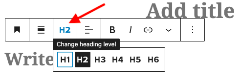
Headings in WordPress #
In WordPress you’ll find a Heading block is one of your options. When you create a page or post, the title is considered Heading Level 1 (H1). Section headings within your page (like all the headings on this page) should be formatted as H2. Subheadings within those sections should be H3, divisions within those subheadings should be H4, and so on as needed.
If you don’t like the default heading size or color you can change this from the right sidebar options for the block.
Lists #
Bulleted and numbered lists can add useful structural information within headings. Screen readers will inform users that they are listening to a list, and can tell the listener how many bullets are in the list.
When using lists, be sure to:
- Contextualize the information in the list with a brief introduction (in this list, “When using lists, be sure to:” is the introduction)
- Use the List block rather than just typing numbered lists in a Paragraph block.
Text #
When choosing font size and color you’ll want to make sure they are legible to users with visual impairments. A 12pt (16px) size font is generally understood to be a good starting point. If using different font styles make sure it is easily read (such as a sans serif font). Make sure there is enough contrast between text color and background color. While black on white might seem boring it is just about the most accessible thing you can do!
Links #
Use Descriptive Link Text #
When adding hyperlinks to your site, use clear and concise language for the link itself. Write out the title of the page being linked or a summarizing phrase or word rather than writing “Click here”. If you were linking to this accessibility guide, a meaningful hyperlink might be Accessible Web Design Guide.
“Naked” links (e.g. https://dkc.umw.edu/tools/accessible-web-design/) are difficult for screen readers to parse and should be avoided.
Forcing users to open a link in a new tab can disorient screen readers and complicate site navigation, so avoid this whenever possible. If you must open in a new tab, inform the user in the link text. For example, DKC Accessible Web Design Tool Guide (opens in a new tab)
Use Visual Design for Links #
Link text should look visually different from the surrounding text. Use a combination of color and style, like underline, to make link text stand out. Using a combination is important. It’s not enough to convey information using color alone. A common combination is underlined text with a blue font color, as seen above.
Visual Design #
When you incorporate an image like a photo, chart or infographic on your site you’ll want to consider:
- Text descriptions of images (alternative text)
- High contrast
- Colorblind friendly color choices
Alternative Text #
For any image on your site that is meant to convey information you should make sure you are providing a text alternative (usually through an alt text field). Alt text should answer this question: What is the information conveyed by the image? Think from the perspective of a user who can’t see your image, what do you want them to know about it? Make sure to describe what additional content the image contains, not just how it looks. If a viewer uses screen reader software, the software will read out the alt text descriptions to the viewer. There are additional benefits of alt text, as it will also be displayed in place of an image if an image file cannot be loaded, and helps search engines index an image properly.
Alt text can, and should, be added to all forms of visual media, including Word documents, PowerPoint slideshows, email newsletters, and PDF documents. Programs like these now might have AI generate the alt text, but its best practice to double check what was added.
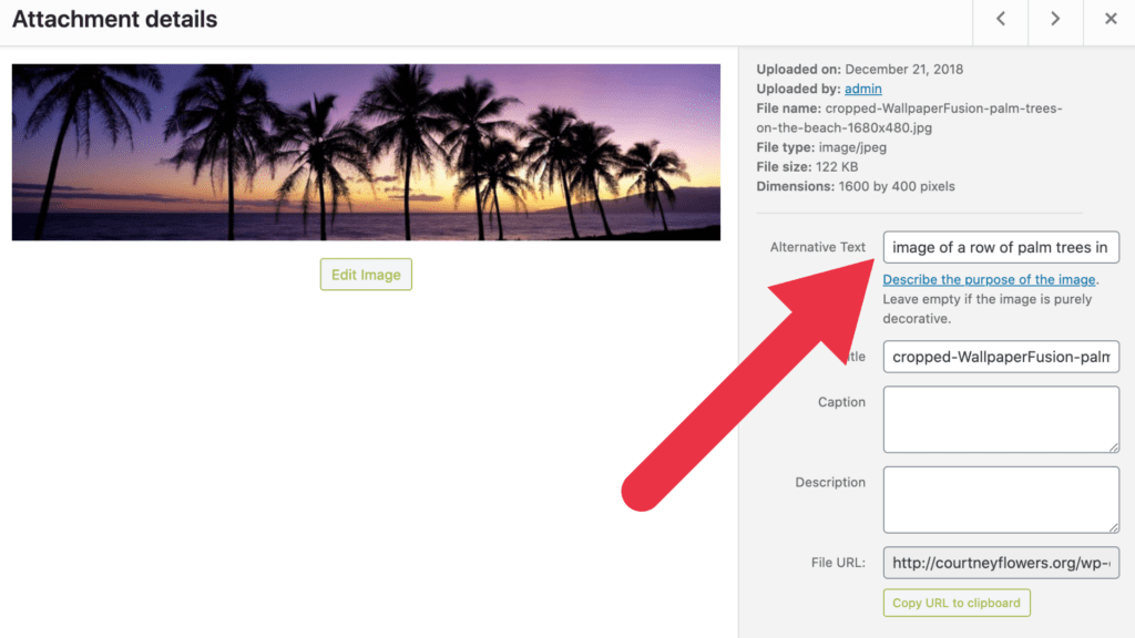
Alt Text in WordPress #
To include alt text on images uploaded to a WordPress site, you will need to edit an image’s metadata which can be done by going to the media library in your dashboard, clicking on the image you wish to add alt text for, and add it under attachment details.
Alternative text (or “alt text’) is used to describe the appearance and function of an image on a page. Alt-text is incredibly helpful for visually impaired viewers who are using screen readers but it also has many other benefits. Alt text will be displayed in place of an image if an image file cannot be loaded and alt text helps search engines index an image properly.
See the DKC’s accessible visual design guide for more details on creating accessible images.
Video #
When incorporating video on your site you’ll want to consider:
- Closed captions
- Make sure the audio is clear
- Audio descriptions
- Make sure visual graphics are understood visually and described verbally
See the DKC’s accessible video guide for more details on creating accessible video.
Audio #
When incorporating audio on your site you’ll want to:
- Providing transcripts
- Make sure the audio is clear
See the DKC’s accessible audio guide for more details on creating accessible audio.
Inclusive language #
Use respectful and inclusive language and avoid unnecessarily using gendered terms. You may also wish to think about the general audience of your content and use plain English where appropriate. While it is fun to sound smart, keep in mind that the average reading level in the U.S. is 7th or 8th grade.
Check the accessibility of your site #
- Copy and paste your website address into the Website Accessibility Evaluation Tool (WAVE) to double-check for any accessibility issues.
- Copy and paste your website address into this Colorblind Web Page Filter to double-check how your website looks to those with different types of colorblindness.
Learn more about web accessibility #
- WordPress Accessibility Handbook – WordPress guide to making sites accessible.
- Access for All – Website Accessibility – Created by UMW’s Office of Disability Resources, contains tips for designing websites that are accessible for all.
Additional WordPress Specific Considerations #
Themes #
Proper theme choice is the foundation for developing an accessible website. At the most basic level, you should choose a theme that is already or allows for high contrast between text and background and uses legible fonts styles.
WordPress does have a “Accessibility Ready” filter when searching for new themes. While WordPress’ Accessibility Ready doesn’t necessary meet the formal definitions set by WCAG for accessibility these themes are often a great place to start from. Themes that don’t have this tag are not necessarily inaccessible but you might need to take a closer look at it.
Once you pick a theme, you can use tools like the Colorblind Web Page Filter and the WAVE Website Accessibility Checker to get a sense of how users will see your site, and identify any issues.
Plugins #
WordPress does not have an official accessibility requirements for plugins so if you are adding a plugin that will add functionality to the public part of your site you’ll want to check the accessibility. You can use tools like the Colorblind Web Page Filter and the WAVE Website Accessibility Checker to get a sense of how users will see your site, and identify any issues.
There are a number of accessibility plugins that can help monitor your site’s accessibility and aid users in navigating your site. We recommend WP Accessibility to support visitors in accessing your website content but there are others out there. Find more on the WordPress Accessibility Handbook – Useful Plugins page.
Updated by Haley Gosman 10/29/24
